Business intelligence and data manipulation with Knime
It’s been a while since I did a proper post about something techy. But I did spend quite a bit of time with Knime, and I love it. So I think it warrants a post. Knime is a complete data mining, manipulation and analysis toolkit. It’s completely open-source and really flexible. I have experience with other ETL and reporting tools, like Talend Open Studio, JasperReports and Pentaho Kettle but for me (in my use-case) Knime rises above them. Talking about my use case, what is it?
Use Case
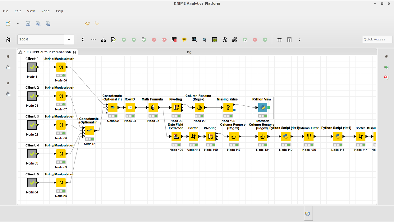
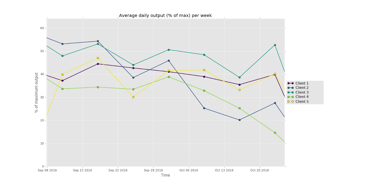
At the solar power company that I am a partner in (among other activities) we sell inverters from various different brands. As a consequence, our clients use a variety of (web-based) monitoring tools. Each with their own dashboard and output. But we need overviews comparing all our clients with each-other, and besides that, we can get extra data from those inverters internally, which allows us to do advanced debugging and monitoring. But visualising that data from those different sources is non-trivial. This is where Knime comes in. We can download exports of the webbased monitoring dashboards that our clients use. Some of them produce csv files, others excel files, and the format of all those files is wildly different. Knime allows me to read in the data from those different files, combine it into one common dataset and then analyse that data. I used it for instance to create an interactive graph that plots the average daily solar array output per week for each of our clients (as a % of their maximum output) so I could compare the performance of each solar array. Knime does it’s work this by creating a chain of “nodes” (operations) that are connected by arrows. Each node does somethings small, like calculate a number, filter rows, rename columns, etc. The data flows through the chain of operations from the start node to the end node.
With the nodes you can do calculations, filtering, joining data, grouping, pivot tables, transposing, etc. It also has graphing tools, and an enormous amount of plugins that let you go into seriously complex modelling, genetics, bioinformatics, geo-information, etc. It allows you to read a whole directory of files, databases, allows you to download data/files automatically from the internet or webservices and interface with online API’s like google analytics and twitter. Most of this stuff I haven’t tried out though.
In the left of the image above you see a bunch of nodes with no input. Those are meta nodes. These allow you to embed whole separate workflow into another workflow. For each client for instance I have a workflow that reads the respective export files, combines them and transforms the data into data that is uniform across all clients. This way you can break complex workflows up into several separate ones. And if I ever need to read the data from one of those clients in another workflow, I just copy the meta-node over to the new workflow without having to redo any work.
Scripting
For me the cool part is that it also has a lot of scripting plugins for different languages. It integrates javascript, Groovy, Java, Python and R scripting interfaces at least. So you can create a small node that does something in python, or leverage the serious statistical power of R. I for instance use the python scripting node to Date/Time manipulations and some other data corrections that I can quickly do in Python. But those nodes are really tiny and easy to maintain.
A larger python node that I created is for visualisation. Knime has quite a few graphing tools, from javascript based ones which can use some awesome graphing libraries for webapplications like Plotly.js, to it’s own internal graphing tool. But none of those were good enough for me. The performance of the javascript based ones was bad with large amounts of data (one of my workflows has a few 100.000 rows) while the internal one wasn’t interactive enough. I decided to go with Python’s matplotlib which is used a lot in the scientific community as is really good. Especially the Pyplot graphs, which have an interactive interface are nice to use, enabling you to zoom in and out, switch data series on and off and save the resulting final graph as a png file.
The below code does the matplotlib work. The code is commented and together with the pyplot docs is quite understandable.
import numpy as np
import matplotlib.pyplot as plt
import matplotlib.gridspec as gridspec
import matplotlib as mpl
from matplotlib import cm

#set the matplotlib style, based on ggplot but slightly adjusted
mystyle = mpl.style.library['ggplot']
mystyle['lines.linewidth']= 1.6
mpl.style.use(mystyle)

#create a gridspec where the graph will take up 5/6 of the grid
#and the legend the last bit

gs = gridspec.GridSpec(1, 6)
fig = plt.figure()
ax1 = plt.subplot(gs[:,0:5])
plt.ylabel('% of maximum output')
plt.xlabel('Time')
plt.title("Average daily output (% of max) per week");

x=input_table['Date'] # a-axis

# variables for the y-axes (data series)
line_cols = [c for c in input_table.keys() if c not in ('Date','Year','Week')]

# use viridis for coloring the data series
ax1.set_color_cycle([cm.viridis(i) for i in np.linspace(0, 1.1, len(line_cols))])

for col in line_cols:
	#plot the data series
    ax1.plot(x, input_table[col], label=col, marker='o')

#setup the legendto the right of the plot
leg1 = ax1.legend(loc='center left', fontsize=10, bbox_to_anchor=(1, 0.5), ncol=1)

#Now some magic to allow clicking in the legend to switch data series on and off
lined = {}

for legline, origline in zip(leg1.get_lines(), ax1.lines):
    legline.set_picker(5)
    lined[legline]=origline

def onpick(event):
    # on the pick event, find the orig line corresponding to the
    # legend proxy line, and toggle the visibility
    legline = event.artist
    origline = lined[legline]
    vis = not origline.get_visible()
    origline.set_visible(vis)
    # Change the alpha on the line in the legend so we can see what lines
    # have been toggled
    if vis:
        legline.set_alpha(1.0)
    else:
        legline.set_alpha(0.1)
    ylim=(None,None)

    #rescale the y-axis according to the currently active data series
    for l in ax1.lines:
        if not l.get_visible():
            continue
        x,y = l.get_data()
        if ylim[0] is None:
            ylim=(min(y),max(y))
        else:
            ylim=(min(ylim[0],min(y)),max(ylim[1],max(y)))
    ax1.set_ylim(ylim)

    fig.canvas.draw()

fig.canvas.mpl_connect('pick_event', onpick)


plt.show()

output_image = ""
Conclusion
Knime is really an end-to-end tool for people who need to work with homogenous data and load, transform and correct them before visualising and analysing the data. Although there is a bit of a learning curve to use Knime, it’s quite user friendly and anyone (without programming experience) will be able to learn to use it. The additional Python and R scripting possibilities and host of plugins take it beyond a simple ETL tool to a proper business intelligence and data analysis suite.